Update from the afterlife

Just kidding. No, I am not dead, though my presence here definitely could indicate otherwise. I will attempt, por professionalism’s sake as well as my own growth, to keep better track of this blog.  There are several posts on the works – one about the graphic design found in the much acclaimed Hawkeye comic book, one about a failed-attempt-turned-happy-experimental-accident of monograms, etc.

In the meanwhile, let me give you, my dearest and meagerly numbered followers, an update on my life.

I did get into SCAD! And in fact, I have already complete one class and am beginning my second one as of yesterday. Class completions will be slow due to my full-time job, but progress will continue.

Here is a peek at the awesome final project for last semester’s class, Typographic Communication, which deserves a full post on its own.


Movie Book Project Cover

Alright, see you very, very soon. In a couple hours soon, in fact.


Dreamscapes: The Fantastical Photographs of Lieko Shiga

Enjoy these eerie and fantastical photographs. Great source of inspiration and a logic puzzle for ‘how did she do it?’.

Dribbble

Ever thought it’d be cool to see a quick shot of what other designers are working on around the world? Dribbble lets you do exactly that. And wow, that sounded like an advertisement.

Anyway, just found out about this site, and it’s pretty neat because the way it works is that you can take a small snapshot or bit of your design/project and post that for others to comment on and review. It seems like there’s a good amount of feedback on this site, which sets it apart from other sites I’ve seen that claimed to have reviews, but there wasn’t the user traffic (or motivation) to actually critique or even comment on people’s works. The user interface is clean and concise, which is really nice (and to be expected of a design website). You can browse designs by color, tags, projects, or ‘buckets’, which seem to be more like general categories. I’m definitely going to be visiting this site for inspiration and to check out easily-digestible bits of design.

Link

Colonia, Uruguay – throwback to the past

These are some of the photos I took during our day trip to Colonia, Uruguay, to add to this previous post about it, since I know at least one of you wanted to see more photographs of Colonia. This quaint little town retained a good bit of its colonial history in the food and the architecture, but even the cars, the wide streets and plazas, the many piers and little boats bobbing on the water surface spoke of love for a simpler, more antiquated lifestyle.

Image

Psychedelic Wallpaper

Wallpaper

I was messing around with the background for the Magic 8 Ball poster I made and posted about here.

I added the woman’s photograph from Creative Rehab because I wanted a focus point, and used several of the free-for-use textures I’ve accumulated over time. There’s about fifteen or sixteen textures in the background alone, all at different transparencies and with various blend modes – some Vivid Light, some Hard Light, some Multiply. There is a base, heavily patterned and contrasting image as the base, then several watercolor splash type textures in between at various transparencies and blend modes, and then a unifying texture on the top, set at the Lighter Color blend mode to give that faded/washed effect.

On top of that was the photograph, set at Darken and 73% transparency. Then I added, with a speckled brush, setting size to pressure sensitivity and with scattering among other things, to do the dots. I added some very transparent large dots to the top right corner as well, and I tried several blending modes for this (including duplicating the layer and setting the second one to divide for an embedded effect), but in the end, this was less garish while still noticeable. The swirl across the top was done with a transparent brush and a Bevel and Emboss effect to give it that translucent/watery look. It’d be more noticeable if I turned up the transparency,  but then that fights for attention with the other elements, so I had to tone it down.

Overall, really just messing around for practice. But I like the end result a lot, so up it goes on my desktop.

Look forward to some more Uruguay pictures this weekend!

Colonia, Uruguay – Sea faring photos

P1020453


These were some of the photographs I took when I went to Colonia, Uruguay. It’s across the Río de la Plata from Buenos Aires, and was founded in 1680, so it has a very strong historical presence. Hope you enjoy them!

Creating a design from a theme and PSA message

Image

I thought I’d talk today about this piece I made for my portfolio. It was inspired by several factors – one is my own interest in current gender norms and rape culture, particularly because of my involvement with Emory’s renowned Respect Program. The other was an exhibit that The Portfolio Center presented at Emory University’s Rollins School of Public Health. The idea was to create an illustration based on a topic – in this case, mental health. Some of these were incredibly simple and powerful, some more subtle and detailed, but they all took an aspect of mental health – self-injury, OCD, dementia, etc – and captured specific nuances of it that people who’ve never had to deal with it oftentimes overlook.

For me, it was particularly inspiring as an exercise – take any abstract topic and create an illustration based on it. So I picked something that was of particular importance to me, though as you will notice, the above image is closer to an PSA than an illustration. I wanted to covey a clear message and practice graphic design more.

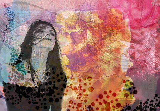
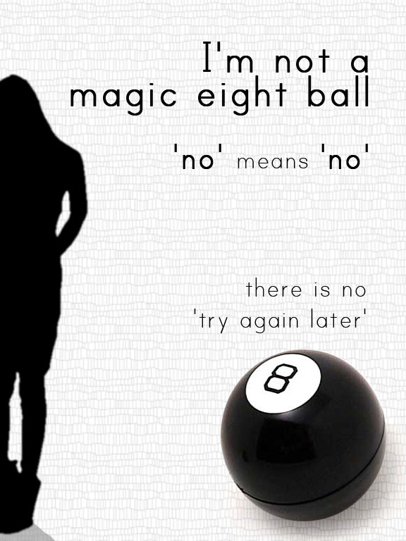
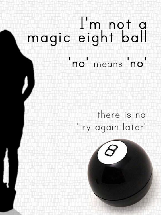
This image went through a lot of versions before this one. All I knew was that I wanted the text “I’m not a magic eight ball, no means no, there is no try again later” to convey the message that if someone doesn’t seem interested in you, stop making unwanted advances on them, a problem that many women have. I wanted a silhouette in order to maintain some anonymity and the sense that it could be any woman (though of course, this can apply just as much to men).

As a personal/cultural side note (feel free to skip this paragraph), I’m conflicted sometimes, because some of the most successful marriages I’ve seen started out with the man being relentlessly persistent when the woman had no interest, until finally she gave in. That formula has been presented as the ideal approach by the female authority figures in my life. And that’s still the general idea being perpetuated in society today – think of all the movies. A man should pursue a woman even when she says no, and that’s okay, it shows willpower and perseverance, and the girl will eventually give in to his tenacity, otherwise she’s a jerk. But I’m also assuming, given the societal norms during the time that these couples I know got together, that the men weren’t making persistent sexual or disrespectful advances. It was simply a plea to give him a chance to take you out, to go hang out with my friends, to go to the beach as friends, because the women would not concede to even holding hands at that point. The decision to become romantically involved would come later. So that’s something to keep in mind, for those who believe that a little insistence or perseverance is needed.

Anyway, off that tangent – that was the message I wanted to convey with the Magic 8 Ball metaphor and the text. To maintain the seriousness of the topic, I was thinking initially of keeping it black and white, and the first few versions came out looking like this:

Image

Image

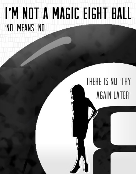
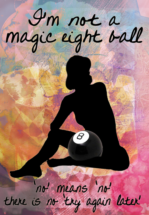
But these two images weren’t all that visually appealing, and didn’t seem to mesh the elements well in my opinion. They were too static, empty. So I went back to my basics: I wanted an eight ball, a woman’s silhouette, and the text. The final picture is less creative in arrangement of the elements – text above and below, central figure. But I think the interaction of the pose and the eight ball, with the woman sitting down and cradling the eight ball in front of her abdomen like that, I think is much more dynamic and personal than the earlier two images. The lively background is a huge improvement in terms of livening up the poster as well, and keeps it interesting even though overall it’s a simple poster.

Probably my only concern at this point, which I will have to go back and play with, is that the font isn’t easily legible because of the background, specifically the bottom text.

So that’s that. I certainly think that picking an abstract topic to create illustration or PSA-style message is a great exercise for a designer and/or illustrator. Hope you found something interesting in the thought process behind this project, and let me know your own thoughts – would you have done something differently? Did you prefer the initial drafts? Is the message conveyed clearly enough? I welcome any criticism.

Image

Ferris Wheel

Ferris Wheel

I return! Yes, yes, I’m sure you all missed my nearly non-existent blog. But I will try to actually maintain a weekly post schedule now, and fill you in on what I have been up to these past months.

First thing is that I finished my portfolio and applied to SCAD, so I’ll probably talk about a few pieces and the process. I should find out within the next two weeks if I did indeed make it into the Illustration Design program.

Secondly, I finished my internship at Emory’s Office of Health Promotion, and I definitely learned some important things there about managing projects and clients.

To close things up for this (brief brief) post, I haven’t had a particularly good track record of maintaining a schedule with this blog (hello eight-month hiatus), but I’ll be more consistent this time around, and try weave it into the regular graphic design and art that I do.

Also, if any of you are interested, I also have a tumblr.

Image

SCAD portfolio review

So I went to the SCAD grad student open house. It was definitely awesome – we got a tour of the facilities, and I love what SCAD has done with the interior of that building. Of course, it’s only to be expected in an institution that includes interior design as one of its departments, but still. We also had a question and answer session with faculty, which included the Communication Arts faculty also, which is what I would fall under, either with graphic design or illustration.

It was pretty amazing. I loved listening to the faculty speak. You always have to take it with a grain of salt because they’re going to paint SCAD in the best light possible at these kind of events, but it felt genuine enough, and even though I’m sure it’s harder to succeed than they make it seem, I still thought that it looked really promising, and you can bet I’m going to work super hard. The Com Arts professors seemed to be pretty honest and certainly humorous, which was nice to see, and they were so psyched about their careers and positions and SCAD and how much they love interacting with grad students. I was super excited to hear them talk. I want to be there so badly.
It sounds like even though I was planning on going in and getting an MA in Illustration Design, I might end up switching over to a full MFA in graphic design, or most likely illustration. I’m okay with that. More expensive, sure, but I would relish being in that environment for a bit longer.

I also had my portfolio review. I wasn’t expecting them to be impressed or anything – I’m painfully new at this. But as long as they didn’t flat out reject me, I was going to be happy. So in those terms, the review session went well – there were a few pieces the professor outright said to take out because they were either unnecessary or mediocre. But he liked this one in particular, and said that if I focused on creating a few more pieces of this sort, then I should be good for entering.

Purple Wedding – CS5 – 2012

Not going to lie,  I was surprised that he liked this one so much. I like it as well, but I thought it was rather simplistic. I mean, that’s good for me because this style comes really naturally to me, so I can definitely make more of these, and in fact, was planning to anyway. He said it reminded him of Hallmark cards, hahaha. But I really want to up my skills a lot more than this, so I’m still going to be working on more realistic pieces and other things as well. The professor was quite nice and offered to review any other pieces I might want to put in my portfolio, which will definitely be helpful. The pieces he didn’t like were kind of interesting because he pointed out right away the areas that I’d had the most trouble with and felt personally dissatisfied with.

Overall my verdict was “drawing skills are ok, painting skills are ok, design skills, meh.” But I should be good if I just create a few more pieces like the above one.

At the moment, I’m planning on entering next Fall, since they said that tends to make more sense in terms of class flow, and for me, in terms of getting ready and having good scholarship opportunities, so I’m going to step my game up and try to have a much better portfolio by January so I can apply then.

*fingers crossed*

TED talk review – data visualization and infographics

David McCandless – The Beauty of Data Visualization

Wonderful TED talk by David McCandles, and it hit several things that were really exciting for me. The first thing was the simplicity of his designs – it supports everything I’ve been reading in Reynold’s PresentationZen: Design book about simplicity and letting your audience focus on the speaker, and having the visuals support the speaker, not the other way around.

I’m continually surprised by what visuals can do. In an artistic sense, that’s easy to understand – a painting or photograph can tell a story – but a design? An infographic? And yet, that’s exactly what McCandless was emphasizing.

Essentially, we’ve been flooded with data and numbers, and we have huge amounts of it just lying around waiting for us to make sense of it. But we all know how difficult it is to make sense of huge amounts of numbers and words. That’s where the visuals come in and are crucial in allowing us to grasp things that otherwise are incomprehensible. It’s one thing saying that 12,000 people died in a natural disaster. But when compare that number to, say, a football stadium or something similar (I have no idea what holds 12,000 people), suddenly that’s easier to grasp.

I’m constantly in awe of how many new discoveries are just lying in wait, how many insightful connections between seemingly unrelated disciplines are out there, just waiting for the right person to take notice.

I’ve actually always loved data and graphs. I love trying to make sense of them numbers and understand what that means in concrete terms. In that sense, this TED talk opened up a possibility that maybe with graphic design I could do something similar to this – mine data and reduce it to comprehensible visuals. I would love to do that.

I was also heartened by his idea that by this point, we have all been made sensitive to design (hopefully good design), and thus have already a design literacy of sorts instilled in us. It’s certainly true that ever since deciding to purse graphic design, I’ve been much more aware of everything from commercials to pamphlets to logos and web design – what its purpose is, the typography, placement, color scheme, etc. I don’t fully understand it all, but I’m paying much more attention to it.

Highly recommend his video, if only for the accent 😉  Listen to how he says ‘data’.

Previous Older Entries