The Next Microsoft

This is a fantastic example of the process of graphic design and re-branding at work. I’m amazed at the insight, the testing and re-testing, and the innovation. Additionally, while the new window design is beautiful, I do wonder at the subjectivity – I’m sure some people thought it was too simple or too abstract. How do designers deal with possible dissent of a design they’re sure is key?

But overall, I loved watching the process and its application to all the different lines and products, and the careful attention to the message that the design was suppose to convey and support.

Link

Just Pick One!

I’m starting to realize that one of the harder lessons for me to learn is going to be choosing. Plain and simple. I’ve been making stickers/logos/etc for Emory’s OHP (office) this summer, and I always have ‘options’. I just can’t pick which one looks better – the logo at the corner, or the logo in the middle. The background in blue, or in white. Same thing with my artwork – the digital kind, at least, usually ends up with several color versions or background versions.

This is a bad habit, but hopefully after some more experience or design classes I’ll be able to decisively pick which one is the best choice for my purpose. At the moment, I’m letting my clients (wow, that sounds so official) do the picking.

Also, these are the designs for one of our projects in OHP. We’re trying to make health be ‘cool’ – I know, tall order. Good thing our unofficial mascot is a skeleton. Makes things a lot easier.

These are extremely rough (and can you see the whole ‘pick one’ problem?), but the inspiration came from a lot of the street art and graffiti books I’ve been reading, and the Skate it or Hang it? exhibition at MODA, which is pretty awesome and full of surprising art and history. You should check it out. My favorite style there was by Charlie Owens, who’s pretty iconic for images like this:

I’m seriously loving the style, and it’s pretty cool how he sticks to his roots of street art and rock-and-roll (reminds me more of American comic books though) even now that he’s an art director and well-established. Check out his Tumblr as well (click-through link on the picture).

Writing vs Visuals

I’ve been doing some readings, which I’ll eventually get to posting about, and doing some sketching and serious thinking. I visited SCAD, and the level of work seen from even the undergrads is amazing, and a bit intimidating, not going to lie. At first I was worried, but now that I’m had some time to process it and get to sketching and coming up with ideas, I’ve realized a few things.

One is that just staring at my sketchbook isn’t going to make an idea spontaneously appear. At the moment, I either need a guiding concept (“the transition from summer into fall”) or to be working from references such as photographs or doing fanart, since there’s automatic investment/ideas for those.When I actually have a goal I’m working towards, coming up with concepts or ideas that I actually feel have potential isn’t all that hard (now let’s see about execution, haha).

Two: A while ago, I’d been worried that I’m so used to telling stories and conveying ideas and concepts via writing (drabbles, vignettes, novelettes, etc), that I automatically turn to words instead of visuals. But as I was working on that earlier summer-fall prompt, it was thinking of how I would express that concept in a story, through a metaphor relating leaves changing color to ink dripping, that allowed me to come up with a good visual. This might be a case of chicken-or-the-egg, since metaphors are used to give a stronger visual to the reader, so maybe I am thinking in visuals, but just apply words to it. In any case, it was a nice surprise to realize that maybe the two mediums aren’t all that unrelated.

Why ‘ta calligraphie’?

I thought I’d briefly mention why the title of my blog is ‘ta calligraphie’. For those who don’t speak French, that means ‘your calligraphy’. First, the choice was aesthetic. I wanted an elegant-sounding word. The ‘ta’ is a bit abrupt-sounding, but that’s where meaning had to override aesthetics. Second, I’m a linguist. I love any opportunity to use one of the languages I know.

But more than that, let’s focus on calligraphy. It’s a beautiful art form, and its elegance is hopefully something I can come to emulate in my art and designs. Calligraphy is fluid, connective, personal and full of character.

Handwriting is a curious thing. At its basest, it is more permanent than speech – once something is written, it cannot be forgotten, and it can be revisited, over and over again, without the danger of time twisting its original form. But writing is also a more deliberate form of communication – it is not as spontaneous as speech. It allows for more in-depth, conscious decisions. You may say that speech is important, and that speech can change the world – but most speeches were probably written, or at least outlined, beforehand.

Beyond that, however, handwriting and calligraphy are deeply personal. Each one of us has a particular way of writing, and these are little clues about us, traces of our personality, fingerprints that others can recognize. No matter how impersonal your words may be, by handwriting them, you are gifting others with a bit of yourself. This is also something to keep in mind when making art or design – no matter what you are making, there are indubitable traces of yourself in it.

How a word looks can be just as important as the meaning the word holds. Form and meaning can complement each other, or they can clash, and each instance has a different meaning. Take, for instance:


Clearly, the font, the handwriting, the form, conveys very different meanings to each word, even though the meaning may be the same. ‘Beauty’, in Dracula font, does not inspire the same feeling as ‘beauty’ in outlined, child-like letters. This is extremely important to take into account.

So, to summarize: your calligraphy is one way in which you are communicating with me. Your calligraphy will tell me little things about yourself that you may not even realize exist. Your calligraphy is a way of making this world yours, more beautiful and personalized. Through your calligraphy, you can leave a piece of  yourself.

What Alice Saw

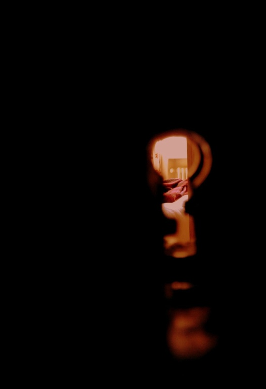
One my favorite photos. Taken in Argentina – we were at an inn that had these old keys and locks, and I was fascinated by the fact that you could see through the keyhole. Imagine the things that were discovered back when you could peek through these. Published in Alloy, Emory University’s literary magazine.

What Alice Saw

Image

Book Annotation – How to Draw: Graphic Novel Style

I dropped by my local Barnes & Nobles (which is closing, what a shame), to browse through some art books. I plan on making this a regular occurrence.

The first book I checked out was Andy Fish’s How to Draw: Graphic Novel Style. And not just because I’ve been on a comic book binge the past year or so. Overall, it’s a short but comprehensive summary of what’s needed to create a graphic novel. It goes from the materials needed, to some tips of the trade, to how to create characters, various art styles, necessary vocabulary, process, color, mood, some history of graphic novels, etc. Like I said, comprehensive. All of the chapters can be expanded exponentially in terms of information, but this is a very good start.

These are the personal reminders that I got out of his book –

Materials that I need to get:

  • Titanium quills & ink (Deleter brand, which is easier to clean than India ink)
  • Technical pens
  • Paper – Bristol, 3-ply with vellum surface is a standard (at least for Marvel comics)
  • A light box (might be helpful for tracing)
  • Brushes for inking
  • Sponge for inking effects

His inking section was particularly helpful – I was surprised at all the creative ways that professional inkers use to create effects – the sponge, plastic wrap dipped lightly in ink, q-tips, dried paper, chopsticks for dots, sharpened chopsticks for smaller dots, toothbrush, razor blade to scrape ink across, or cut away thin lines for rain, etc.

There was also the tip of pouring the frisket (liquid that covers areas you want to keep white while you ink and work, and at the end you remove it and the area has remained clean) into a separate container so as to not contaminate the whole bottle while you’re working.

I really want to try using brushes for inking. That wouldn’t work for thin details (which I’m a fan of), but maybe backgrounds or just large dark areas (which are commonly seen in American comic books, but I’m still not used to them).

The book was also a reminder for me to experiment with color choices. So far, I tend to stick with ‘realistic’ color choices. I should pick a limited palette – only warm colors, or only cool colors, or a combination of three or five – and create a painting with just those. That’d be a good exercise.

I also learned one really easy way to create shadows on Photoshop – create a new layer over the base colors, brush the shadows in gray, and then set that layer to multiply. Voila! You get darker shades of the base colors. I had no idea.

A few references he gave at the end of the book that I’m interested in checking out were –

iPhone apps: comiczeal and comixology

Supply websites: ccowell.com, dickblick.com, and comictones.com

Books: Comic Artist’s Photo Reference: People & Poses by Buddy Scalera, Dynamic Anatomy, and Dynamic Figure Drawing, both by Burne Hogarth.

In that same series of “How to Draw:” there was a graffiti one, and I checked that one out too because street art is amazing. I love the rituals they have – I didn’t know the styles were differentiated, with the bubble letters called ‘throw-up’ (because you throw it up on the wall, not to do with puking), and then the 2D and 3D styles, and the crazy wild style, which was totally illegible to me, but apparently they can decipher it no problem. Very cool. Makes me wanna create my own tag (like a signature, basically) just to play with the styles. I think it’d be cool to incorporate graffiti styles into some illustrations. It was also illuminating to see their process – what layers they start with, how they go back and edit, the different cap sizes that change the width of the line of spray paint (need to get me a fat cap and a skinny cap).

Also found a tattoo book, and this design kind of called out to me. Delicate, fairly representational of my sense of aesthetics, and I have a major thing for butterflies, cliché as they may be.

Butterfly tattoo


Portfolio presentation tips by Dan Slott

Dan Slott has a short and sweet post of advice about portfolios. Some of it is fairly obvious, but most of it consists of pretty good pointers or reminders. I recommend checking it out for some good, straightforward advice.

The ones relevant to me were:

  • Bring pen & paper to jot down criticism from reviewers – it shows you’re prepared, willing to improve, and respect their input.
  • No excuses – accept the criticism as is.
  • Show your best side – this is their chance to get an idea of what it would be like to work with you.
  • Show a range of your strongest work, preferably in order of strength, and constantly weed out weaker works in your portfolio.
  • Have samples with contact information one each page, ready to hand out

First Impressions

So, I’ve been messing around with Photoshop, SAI, trying to learn a bit about typography, PSDs, and… it’s pretty daunting. There are tutorials everywhere, a million resources, and copyright laws. There also seems to be… different directions to take this in.

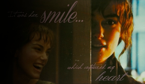
One thing I see a lot of, for movies and whatnot, are edits. Taking screencaps and doing things with them. For example, my first attempt (quite awful, but I have to start somewhere):

Image

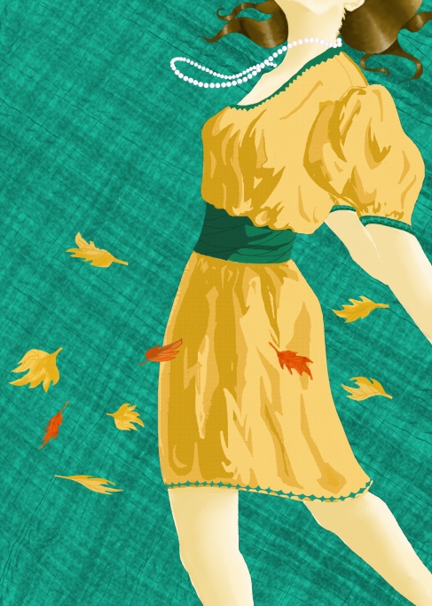
This seems involve an eye for textures, adjustment layers, etc. I’ve downloaded a few PSDs I’ve found out there, but since they’re basically pre-made effects that can apply to (almost) any photograph, I’m only going to use them as learning tools to study what things people do and what Photoshop is capable of. Photoshop is pretty frustrating though… not intuitive at all. SAI is much more manageable and natural to use, though of course it’s much simpler and works better for art:

Image

As of now, most fonts, textures and PSDs I have are found at this Tumblr site: fuckyeahresource. I’ve also found some great textures and brush packs at Ex-posed. All of those are posted for personal use, but not for commercial. I guess professionals either buy these resources or create their own?

In the beginning…

… there was a blog ♣

Quick intro: I’m an aspiring graphic design and illustrator, just graduated from Emory University in the rather unrelated fields of biology and linguistics. This blog is my attempt to track the development of my skills and provide one place to note all my resources, processes, and findings. There will also be commentary about the fields of graphic design and illustration as I begin to research them.

It’s also likely that this will become my catch-all destination for random bits of writing, photography, and artwork.

I’m notoriously awful at note-taking, so we’ll see how long this I am able to keep this up. If you are following this blog, I hope you enjoy it and find some useful links and artwork here.

Have fun perusing!

Image

Next Newer Entries