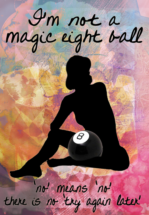
I thought I’d talk today about this piece I made for my portfolio. It was inspired by several factors – one is my own interest in current gender norms and rape culture, particularly because of my involvement with Emory’s renowned Respect Program. The other was an exhibit that The Portfolio Center presented at Emory University’s Rollins School of Public Health. The idea was to create an illustration based on a topic – in this case, mental health. Some of these were incredibly simple and powerful, some more subtle and detailed, but they all took an aspect of mental health – self-injury, OCD, dementia, etc – and captured specific nuances of it that people who’ve never had to deal with it oftentimes overlook.
For me, it was particularly inspiring as an exercise – take any abstract topic and create an illustration based on it. So I picked something that was of particular importance to me, though as you will notice, the above image is closer to an PSA than an illustration. I wanted to covey a clear message and practice graphic design more.
This image went through a lot of versions before this one. All I knew was that I wanted the text “I’m not a magic eight ball, no means no, there is no try again later” to convey the message that if someone doesn’t seem interested in you, stop making unwanted advances on them, a problem that many women have. I wanted a silhouette in order to maintain some anonymity and the sense that it could be any woman (though of course, this can apply just as much to men).
As a personal/cultural side note (feel free to skip this paragraph), I’m conflicted sometimes, because some of the most successful marriages I’ve seen started out with the man being relentlessly persistent when the woman had no interest, until finally she gave in. That formula has been presented as the ideal approach by the female authority figures in my life. And that’s still the general idea being perpetuated in society today – think of all the movies. A man should pursue a woman even when she says no, and that’s okay, it shows willpower and perseverance, and the girl will eventually give in to his tenacity, otherwise she’s a jerk. But I’m also assuming, given the societal norms during the time that these couples I know got together, that the men weren’t making persistent sexual or disrespectful advances. It was simply a plea to give him a chance to take you out, to go hang out with my friends, to go to the beach as friends, because the women would not concede to even holding hands at that point. The decision to become romantically involved would come later. So that’s something to keep in mind, for those who believe that a little insistence or perseverance is needed.
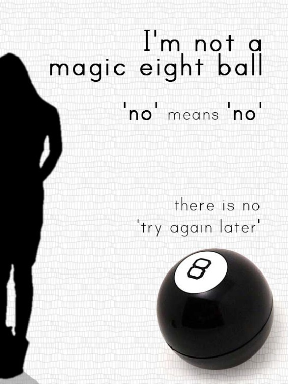
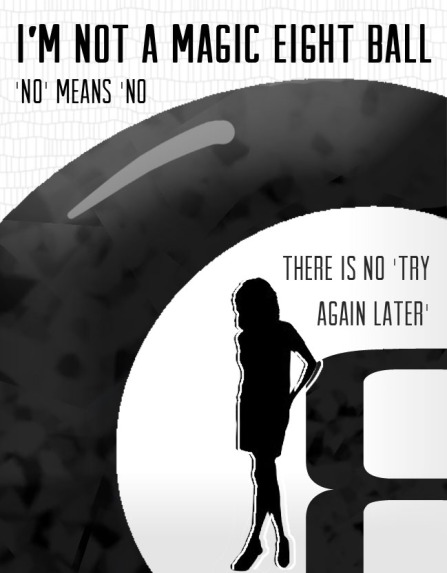
Anyway, off that tangent – that was the message I wanted to convey with the Magic 8 Ball metaphor and the text. To maintain the seriousness of the topic, I was thinking initially of keeping it black and white, and the first few versions came out looking like this:


But these two images weren’t all that visually appealing, and didn’t seem to mesh the elements well in my opinion. They were too static, empty. So I went back to my basics: I wanted an eight ball, a woman’s silhouette, and the text. The final picture is less creative in arrangement of the elements – text above and below, central figure. But I think the interaction of the pose and the eight ball, with the woman sitting down and cradling the eight ball in front of her abdomen like that, I think is much more dynamic and personal than the earlier two images. The lively background is a huge improvement in terms of livening up the poster as well, and keeps it interesting even though overall it’s a simple poster.
Probably my only concern at this point, which I will have to go back and play with, is that the font isn’t easily legible because of the background, specifically the bottom text.
So that’s that. I certainly think that picking an abstract topic to create illustration or PSA-style message is a great exercise for a designer and/or illustrator. Hope you found something interesting in the thought process behind this project, and let me know your own thoughts – would you have done something differently? Did you prefer the initial drafts? Is the message conveyed clearly enough? I welcome any criticism.
